Aspect ratio
The aspect ratio component shapes the content with the specified ratio.
The default aspect ratio implementation combines height: 0px with percentage padding-bottom to create the proper aspect ratio for the content.
(It will be replaced by the CSS aspect-ratio in the future once it has sufficient browser support).
- The content to fit the area of the aspect ratio component must be its first direct child.
- It's designed to be composed with other components, e.g.
Card.
Basic usage
The default aspect ratio is 16/9.
<Sheet
  variant="outlined"
  sx={{ width: 300, borderRadius: 'md', overflow: 'auto' }}
>
  <AspectRatio>
    <Typography level="h2" component="div">
      16 : 9
    </Typography>
  </AspectRatio>
</Sheet>Ratio
Use the ratio prop to change the aspect ratio.
The value will used by the CSS calc().
<Sheet
  variant="outlined"
  sx={{ width: 300, borderRadius: 'md', overflow: 'auto' }}
>
  <AspectRatio ratio="4/3">
    <Typography level="h2" component="div">
      4 : 3
    </Typography>
  </AspectRatio>
</Sheet>Media
Place a native html <img> or <video> as a first direct child of the aspect ratio component.
Use the objectFit prop to change how the media should be resized in order to fit the aspect ratio component.
It has object-fit: cover by default.
<AspectRatio objectFit="contain">
  <img
    src="https://images.unsplash.com/photo-1502657877623-f66bf489d236?auto=format&fit=crop&w=800"
    srcSet="https://images.unsplash.com/photo-1502657877623-f66bf489d236?auto=format&fit=crop&w=800&dpr=2 2x"
    alt=""
  />
</AspectRatio>Placeholder
When the media does not exist, you can render a placeholder inside an aspect ratio component. Wrap the placeholder with a <div> or Box component to center the content.
Title
Description of the card.
<Card variant="outlined" sx={{ width: 300 }}>
  <AspectRatio>
    <div>
      <ImageIcon fontSize="xl5" sx={{ color: 'text.tertiary' }} />
    </div>
  </AspectRatio>
  <Typography mt={2}>Title</Typography>
  <Typography level="body2">Description of the card.</Typography>
</Card>Controlling the height
Use minHeight and maxHeight to set the lower and upper bound of the component's height.
This is useful when the aspect ratio is used in a component that has dynamic width.
<AspectRatio minHeight={120} maxHeight={200}>
  <img
    src="https://images.unsplash.com/photo-1502657877623-f66bf489d236?auto=format&fit=crop&w=800"
    srcSet="https://images.unsplash.com/photo-1502657877623-f66bf489d236?auto=format&fit=crop&w=800&dpr=2 2x"
    alt=""
  />
</AspectRatio>Inside a flex row
When the aspect ratio component is placed as a child of a flexbox row container, use flex-basis to set the ideal width of the aspect ratio.
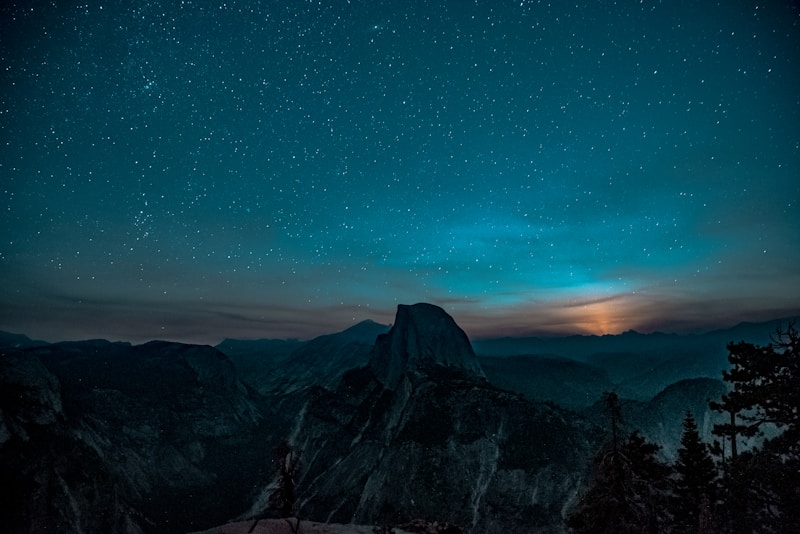
Yosemite National Park
California, USA
Integration
Next.js Image
The AspectRatio component can be used with Next.js Image component.
import Image from 'next/image';
import AspectRatio from '@mui/joy/AspectRatio';
import mountains from '../public/mountains.jpg';

function App() {
  return (
    <AspectRatio variant="outlined" ratio="1" objectFit="cover">
      {/* only layout="fill" makes sense for using with AspectRatio */}
      <Image alt="Mountains" src={mountains} layout="fill" placeholder="blur" />
    </AspectRatio>
  );
}
Common examples
Mobile carousel
Make sure to keep your content concise given the limited width real estate available.
Since the texts are short, we can set white-space: nowrap to make the title stay in one line.
The min-width CSS property is necessary on the aspect ratio component to prevent it from shrinking to zero.

Night view
4.21M views

Lake view
4.74M views

Mountain view
3.98M views
Night view
4.21M views
Lake view
4.74M views
Mountain view
3.98M views